Measure Actual Delivery

Teams and stakeholders need to track how and when teams deliver value. How many features and operational capabilities have been delivered? Understand that information by measuring actual Working Tested Features (WTFs) shipped, not low-quality proxies such as story points or date estimates.

Pain Points

  • Estimates never agree with reality
  • Large amount of time and energy wasted on calculating proxy measurements such as Function Points or Story Points
  • No management-level visibility into the team’s progress
  • Management has no view of the team’s current status regarding WTFs ready to ship
  • Frequent micromanagement

Benefits

  • Near real-time visibility—the ability to know the a product’s current state
  • Coarse-grained predictability—the ability to guess when more WTFs will arrive in production
  • Understanding features vs cash burn rate—understanding the development cost
  • Reduced time to market

Assessment

  • Stakeholders can see the current set of working, tested features ready to ship (Major Boost)
  • Stakeholders have some idea of progress but the data is not always current (Boost)
  • There is a process for stakeholders to see the current set of WTFs but it’s rarely executed (Setback)
  • Stakeholders have no mechanism to see the results of work in progress (Significant Setback)

Application

✓ Critical ❑ Helpful ❑ Experimental

Adoption Experiment

First steps to create this habit:

Setup

  1. Break the work into roughly similarly sized user-visible features and equivalent non-visible functionality
  2. List the features in priority/work order up the left side of a graph (Y-axis)
  3. Start the clock running with days on the X-axis

Trial

  1. As WTFs are completed and ready for public release, note that on the graph. Reorder features on the Y-axis as needed, so that completed features are continuous on the bottom and uncompleted work is on the top along the Y-axis.
  2. After a reasonable number of WTFs have been completed (say, 1/3 or so), draw a line through the dots to extrapolate the team’s progress. Where that line intersects the top of the list of features gives you a rough idea of an actual completion date according to the work currently on the burnup.
  3. As priorities shift and WTFs are completed, adjust the list on the Y-axis and continue plotting.

Evaluate Feedback

  1. How accurate was your early extrapolation in identifying a completion date? Did that accuracy improve with ongoing extrapolations?
  2. Were WTFs marked as completed actually completed (actually working, tested and ready for release?)
  3. Was additional work added to the burnup chart (see below) as needed? What did that do to the expected completion date?

What Does it Look like?

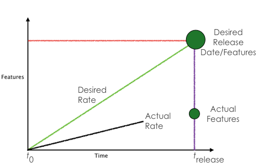
This habit creates good sense of actual work completed, using a simple graph form. Time goes along the X axis, and all the work that’s ready to ship on the Y axis. We call this a burnup chart.

Burnup_all.png

Time on the X axis should be in days, but if you are just starting out and only delivering on several-week iterations, then use iterations.

Measuring a team’s actual delivery provides transparency into the development team’s value delivered. It’s an important aspect of keeping people informed of work being done.

By keeping burnup charts current with work completed, anyone can see what items have been completed. This visibility provides status updates answering questions about current work allowing teams to avoid interruptions. It also provides a self-serve capability for stakeholders to get status information.

This works best when the “features” or bits of completed work are roughly the same size (which they should be, otherwise the team isn’t breaking work down into manageable pieces effectively). Also, although we call them “features” here for simplicity, the chart should include any and all work the team is doing.

The speed at which a given team delivers features is a constant. It will not suddenly get greater due to adding team members or adding overtime. With consistent feature sizes, you can easily extrapolate the number of features the team can deliver at any future time by drawing a straight line.

Important: Notice that a burnup is different from a traditional “burndown” chart. A burndown chart ignores additions over time. You could be chasing an ever-changing target. With a burnup chart, you’ll can more easily track changes to the total work required as feedback and learning increase over the life of the project.

Warning Signs

  • Teams are constantly interrupted with status requests (e.g., “Is it done yet?”)
  • Stakeholders ignore the burnup and interrupt team members for status updates
  • Stakeholders don’t answer developer’s questions
  • Other necessary work (maintenance, non-user-facing requirements, infrastructure) is omitted from the burnup, but still consumes developer’s time

Growth Path

Create a baseline by monitoring your team’s burnup charts over several months. As you learn what they’re capable of delivering, you can use that information to provide more accurate or realistic releases.

Exercises to Get Better

You may want to experiment with different data elements or graphs to determine which method best represents value for your organization. This is okay as long as you stick to actuals and avoid proxies to the extent possible. A proxy may help provide some anecdotal information but should never be used as a substitute for actuals when that information is available, even if using a proxy seems easier, it’s always only going to be an approximation.

How To Fail Spectacularly

  • Identify features as done after the first pass or before being thoroughly tested by users
  • Fail to keep your burnup charts up to date and have everyone converge on your location for status updates
  • Put all your faith in a special tool

  ←Prev (Work in Small, Stable Teams)(Lead the Way) Next→


Follow @growsmethod in the Fediverse, or subscribe to our mailing list:

Sign up for more information on how you can participate and use the GROWS Method®. We will not use your email for any other purpose.